Designing a smarter system
for order placement,
management, and
fulfillment

Synopsis
After identifying multiple improvements in the
processes that my aunt uses to run her bakery
business, I built a website with custom dashboards
to streamline her workflow, along with a
customer-facing point-of-sale system, complete with
shopping cart management and checkout.
Tools
The Backstory
My aunt runs a small bakery business, and used to do
all of her operations manually and on paper. She
received orders by email, then went through a
lengthy back-and-forth process to figure out
additional requests, costs, location of delivery,
etc.
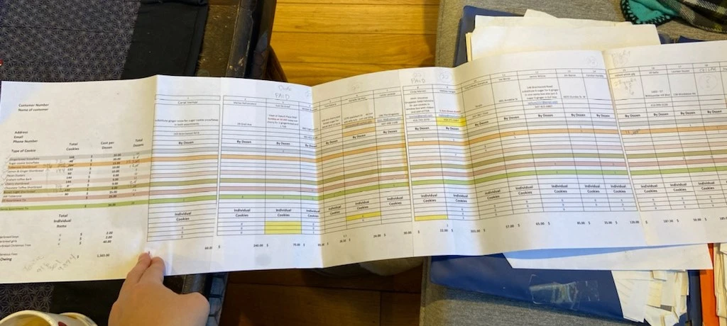
Once orders started rolling in, she would compile a
huge spreadsheet of orders (manually inputted of
course), which she would print off to track order
completion in pencil. As orders rolled in, she
needed to print out more and more pages while doing
her best to keep track of delivery dates, weekly
inventory and batches.
TL;DR: It was a nightmare.

The spreadsheet of doom...
I realized a better solution was necessary, one that
allowed my aunt to focus on her important tasks and
leave the menial ones to automated software.
The Problem(s)
Before I could begin the project, I needed to
identify my aunt’s biggest pain-points. In order to
come up with the most effective and minimalist
solutions, identifying the root cause of each
pain-point was crucial, as one solution may solve
multiple symptoms of the same problem.
After a few 1-on-1 consultations, I identified the 3
main divisions of her work, and the problems she was
facing in each.
Placement
Receiving and sending correct order
information
Pain Points
Receiving orders is manual & time
consuming
-
Calculating
order costs
-
Sending/receiving
order information
emails
Management
Special requests & what needs to be
baked
Pain Points
Inputting data into a spreadsheet is
error-prone and reading it is difficult
-
Too much information
at once
-
Minimal distinction
between spreadsheet cells
- Disorganization
Printing the spreasheet is unruly
-
Wasted space
on each page
-
Unnecessary information
on each page
Tracking quantities is manual
Fulfillment
Knowing order details and order
status
Pain Points
No good way to see
specific order
details
No good way to
print off
specific order details and attach it to
an order
Tracking completed orders is
manual and
cumbersome
Defining Success
Ideally, solving all of my aunt’s pain points is the
goal.
However, to distill the metrics for
success into measurable goals, it would be thus:
1. Minimize
time-consuming tasks (e.g.
manual processing)
Measured quantitatively by overall
time expenditure
2. Optimize customer and client (my aunt)
user experience
Measured qualitatively by
user feedback
Choosing the Right Tools
I knew I wanted to build a website to solve these
problems. Although I had never built one by myself,
at the time I was working as a full-stack web
developer, so I had some knowledge in the field.
Why a website? Not only is it accessible from any
device, the possibilities of the web are endless if
you use the right tools.
Since I was inexperienced, I figured the best way to
learn more would be to ask a professional in the
industry. I approached my manager, a software
developer with years of experience, and explained
the project. He recommended using Next.js and
tailwindcss for the front-end, Supabase for the
back-end, and Vercel to host the website. All of
which are modern tools and easy-to-learn.
I also needed a tool for prototyping the UI, so I
decided to use Figma - a suggestion from another
coworker.
So, with no experience with any of those tools, I
jumped right in.
I was keen on tackling the biggest issue my aunt was
facing first, so I decided to jump into the second
stage in the order process before solving everything
else.
Since I had already identified key pain-points, I
began working on a solution to address as many as
possible.
I began by asking my aunt exactly what information
she needed when baking. I identified which
information from the order was useful to see, and
which was useless. I worked on the design principle
of displaying the least amount of information
possible. Nothing more, nothing less. Designing in
this manner reduces cognitive load, and allows
information retrieval to be more efficient.
In the end, she needed the total quantities in
dozens and in individual goods that needed to be
baked per week.
Ideation
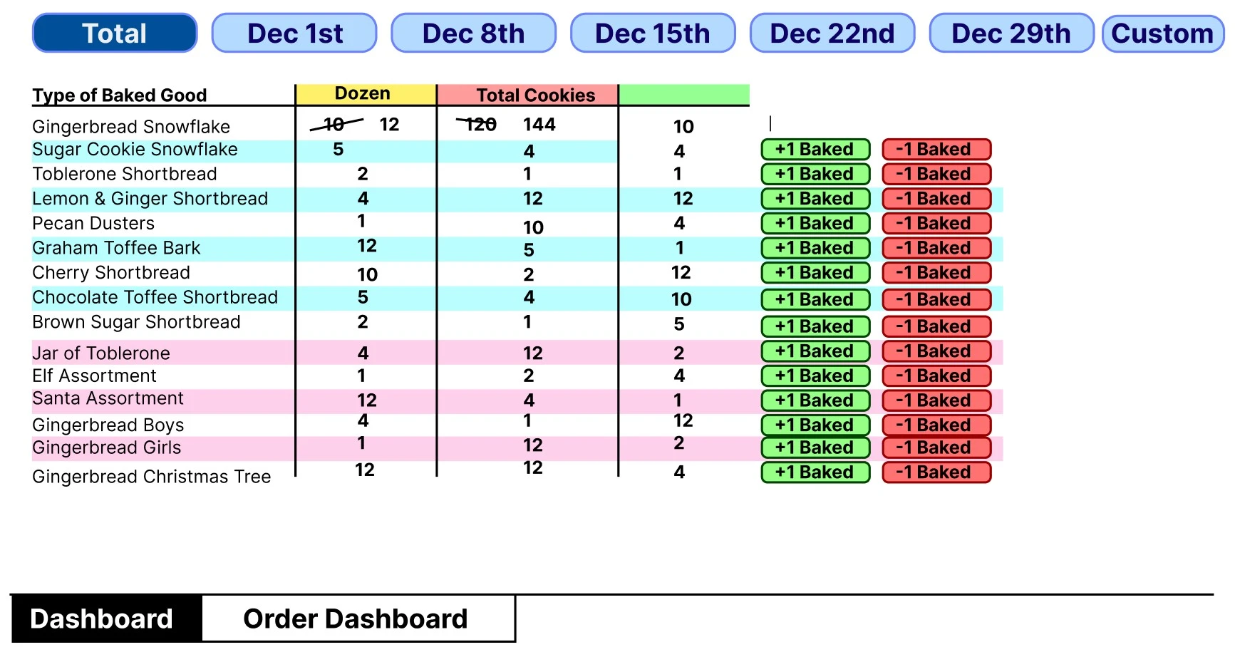
I got to work in Figma, and threw together some
low-fidelity prototypes as a proof of concept.

I came up with a dashboard that would display only
the information she needed, which could be filtered
to display only what was necessary for that week. It
also had the ability to add and remove the number of
items that had already been baked.
I presented this design to my aunt, and she tore it
apart. Well, not entirely. But she offered a lot of
helpful feedback, which I used to implement my
high-fidelity prototype designs.
For the design language of the high-fidelity
designs, I thought I’d keep it consistent with the
look and feel of my aunt’s current website, with
fonts, colours, and shapes all the same or similar
to preserve uniformity.

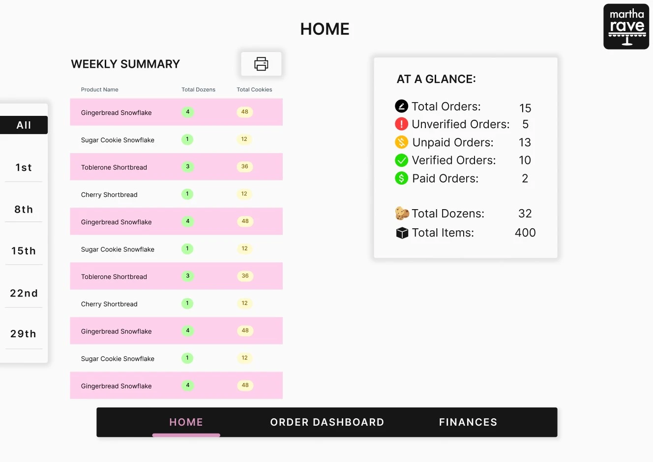
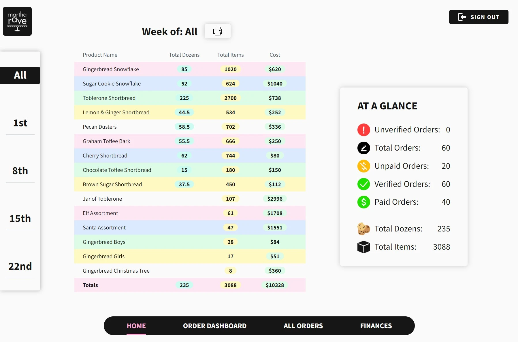
Here was the final design of the homepage dashboard.
It contained a filter on the left to sort by date, a
table of products with total dozens and total items,
along with a handy breakdown of order statuses. My
aunt didn’t need the ability to add and remove
quantities that had been baked, so that feature was
scrapped.
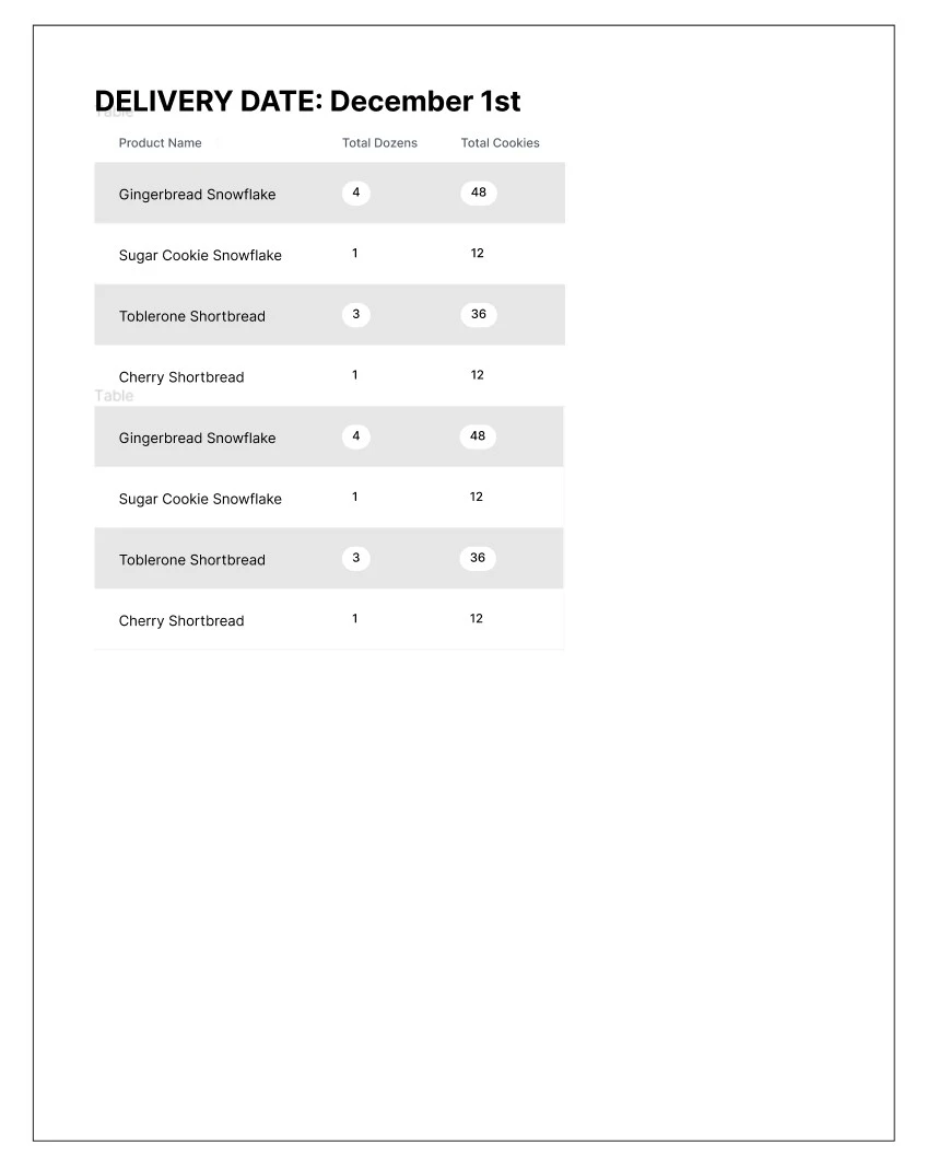
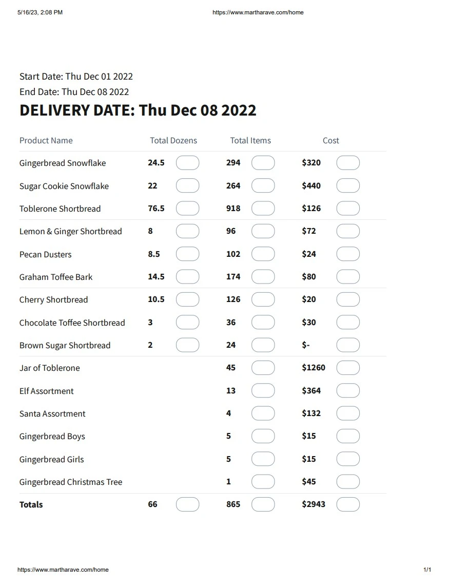
To solve the issue of printing out the entire
spreadsheet, I added a print feature that allows my
aunt to print only the table, showing her what she
needs to bake each week. This cuts down the number
of pages she was printing from over 10 per week, to
1 per week.

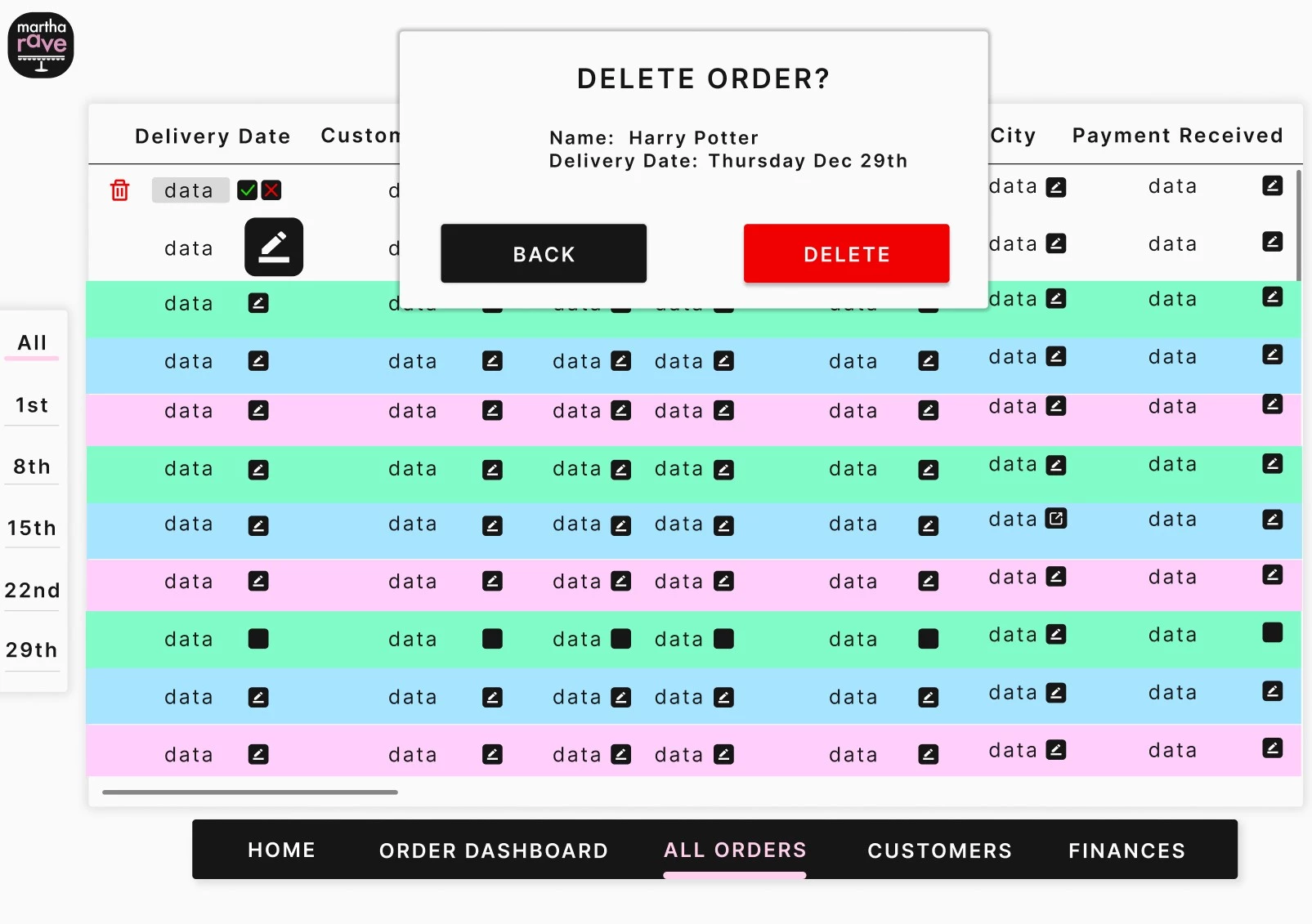
The last thing I needed to add in the management
step was a way for my aunt to modify orders. In
hindsight, there are so many better was I could have
implemented this feature, but I was working with
time constraints and I needed a solution that would
be relatively easy to implement into code.
Here's what I came up with:

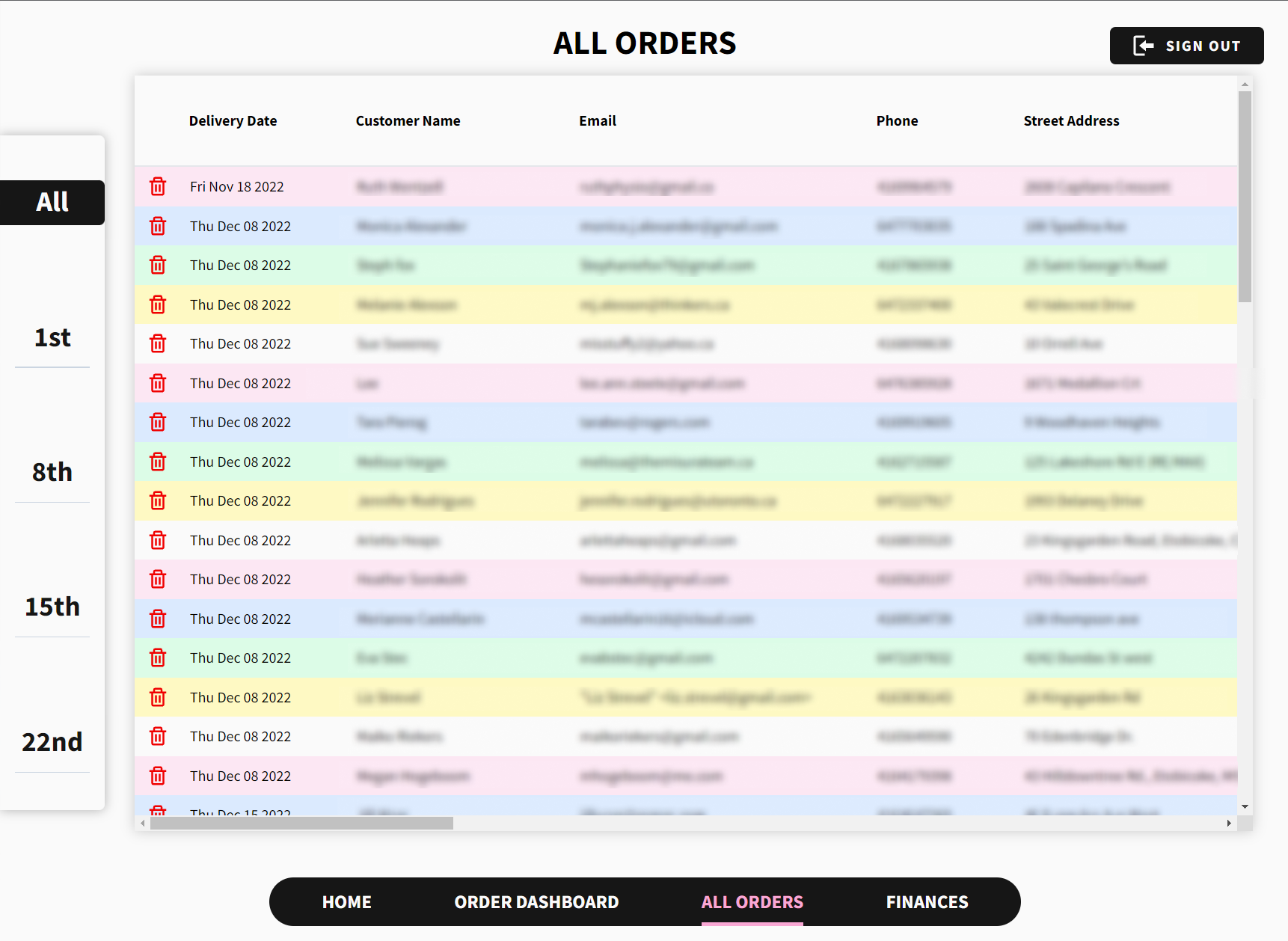
Yep, a spreadsheet. A boring old spreadsheet. Not my
proudest moment, as I sought to remove all the
problems spreadsheets brought with them when I began
this project. However, I did optimize the many pain
points my aunt was facing, even while working within
the constraints of a spreadsheet.
First was using colours to distinguish between
spreadsheet rows. Second, I added protection to
editing a row and deleting an order. Since my aunt
has to click on the edit button, then click
“confirm”, it prevents accidentally wiping any
records from the spreadsheet.
I figured, since order won’t be inputted manually,
there would be a low likelihood that my aunt would
need to edit orders at all, so by sticking to a
straight-forward and easy to implement solution, I
could spend time on the more important parts of the
platform.
To solve the pain-points in the placement step, I
started off by analysing the current ordering flow.
Consultations with my aunt and viewing emails from
previous customers showed me the steps most
customers follow.
- Navigate to martharave.com
-
View the picture slideshow of baked goods on the
website
-
Send an email directly to my aunt with the names
and quantities of each item
-
Wait for a response from my aunt with the order
total
- Pay on delivery or by e-transfer
I noticed some problematic user-experience issues in
this flow. The biggest offenders were having to
navigate to an external platform to place an order
and having to wait to receive the order total or
calculate the cost in your head. In order to address
both customer and client user-experience pain
points, I decided to implement a traditional
checkout. This would streamline the ordering flow,
and solve each of the identified pain points.
How would it solve them? Customers would be able to
order from within martharave.com, eliminating the
need for email correspondence. This would save time
and effort for the customer and for my aunt. They
would also know order totals as they ordered it,
since it would be calculated by the software.
Ideation
I began the design phase of the project by
researching existing implementations. I looked at a
few example of classic Shopify checkouts, and noted
things I liked about them as inspiration. A few
specific things I liked were the size and placement
of the product images and appearance and
functionality of the quantity selector.
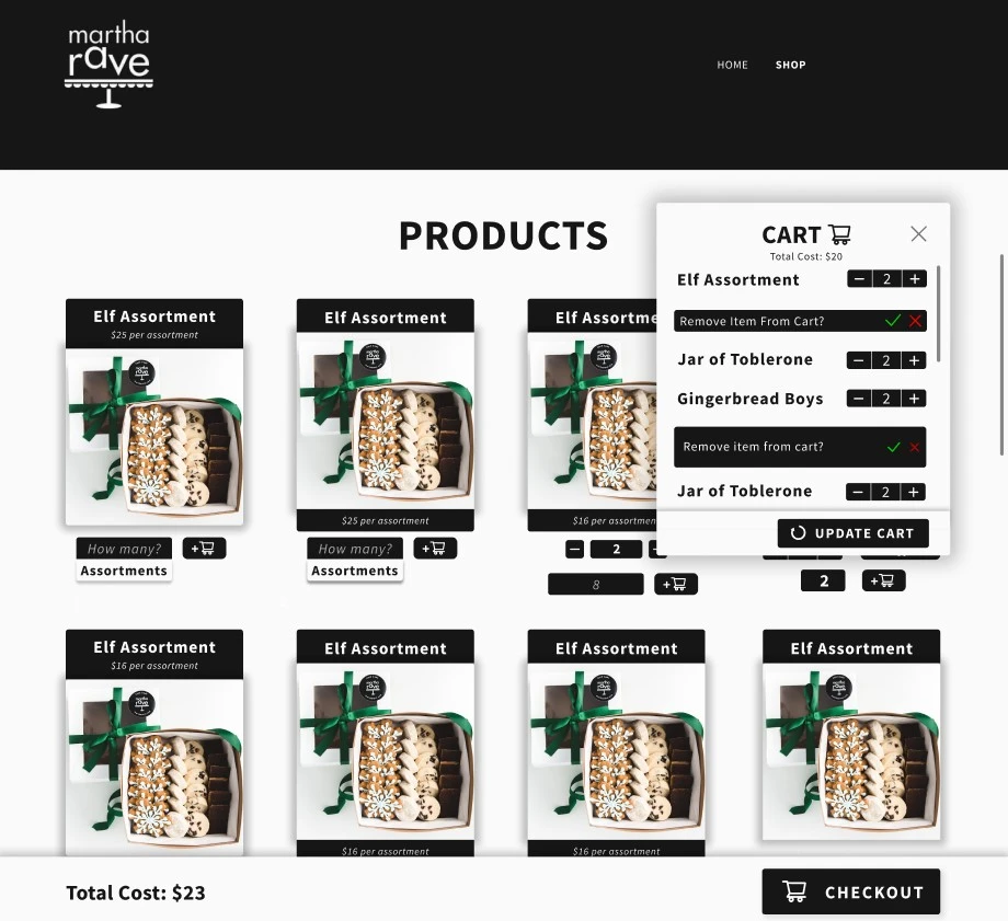
Here are a few of the initial designs:
I experimented with placement of text, different
types of buttons and methods to select quantities.
After implementing the design I thought most
intuitive, I did some live user-testing with my
aunt. I had her walk through the checkout flow and
identify any points of friction.
One thing that I didn’t expect in this process was
when she couldn’t understand how to update the
quantities of the items. I thought it was very
intuitive, but I was wrong.
After showing her alternate designs, she ended up
picking a different one that made more sense. This
process was very eye-opening and taught me
first-hand the importance of user-testing!
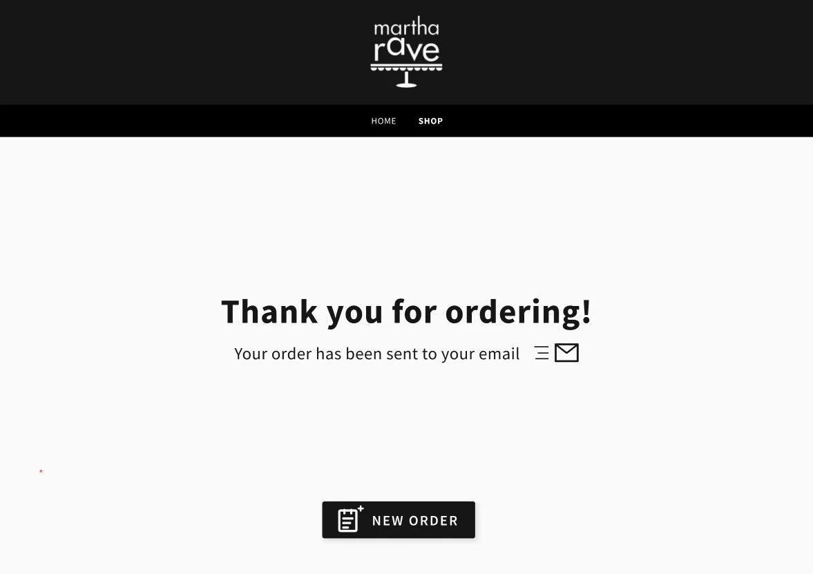
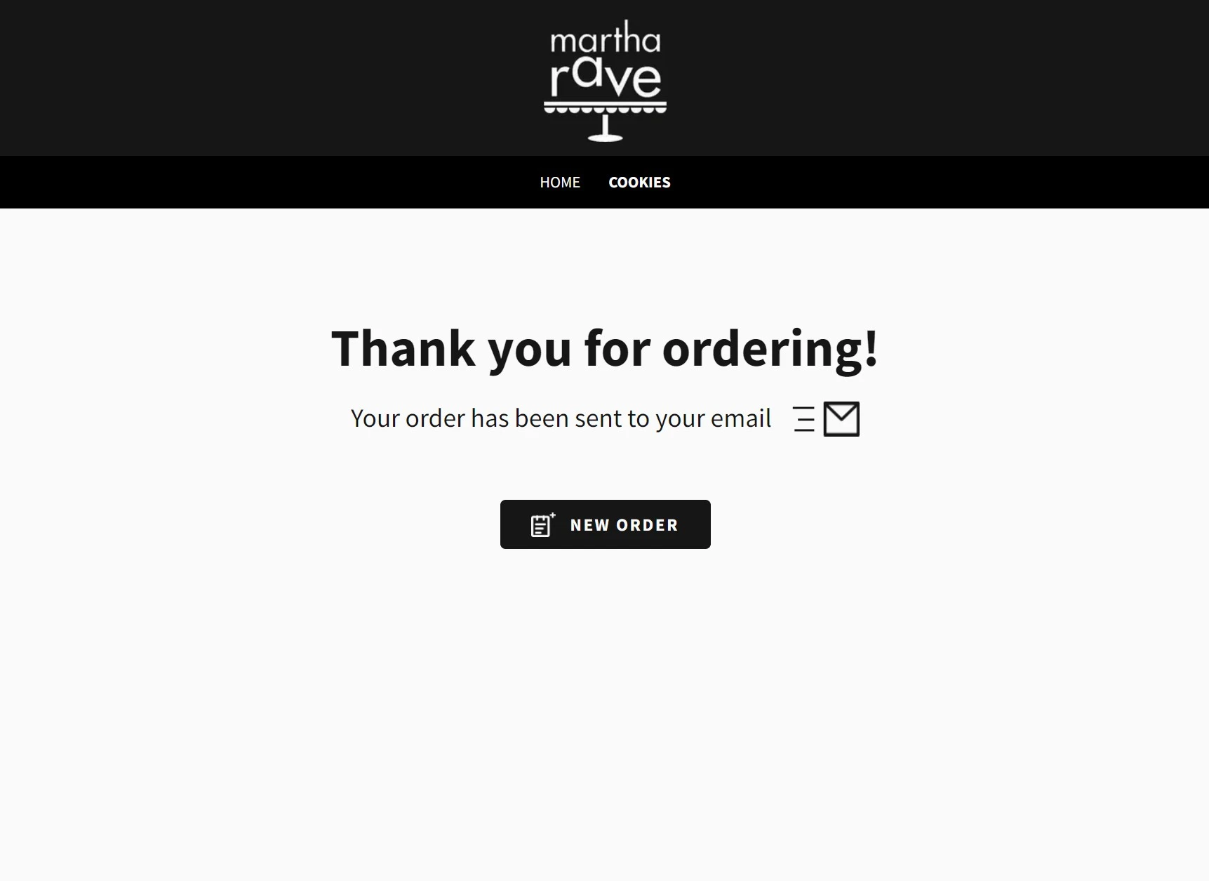
And here's a mock I whipped up for the thank-you
page after a user is finished checking out:

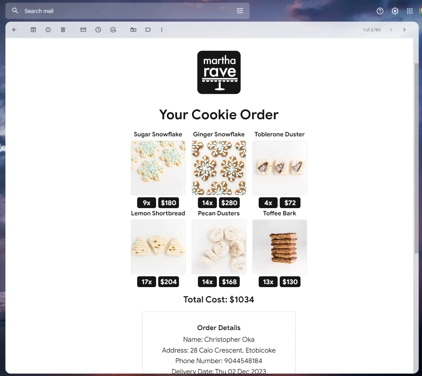
The final feature I wanted to implement in this step
is an email that is sent to the user upon order
completion. This email would contain all of their
order information as well as total cost, which is
effectively their order receipt. This removes the
need for my aunt to send customers emails to confirm
their orders. Due to time constraints, I skipped
developing prototypes and instead jumped directly
into the implementation which I'll show off at the
end.
The final step in the process was fulfillment. The
main things I needed to fix was seeing specific
order details, being able to print off order details
and tracking completed orders.
Once again, I wanted to limit the amount of
information that’s displayed to my aunt, preventing
information overload.
Ideation
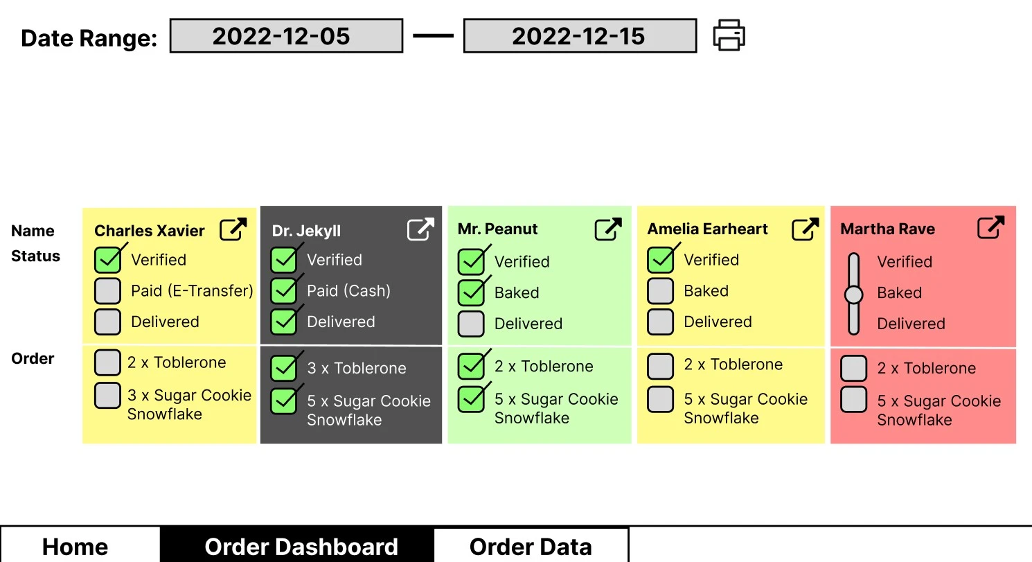
Here's the low fidelity-prototype I started with:

This design attempts to solve all of the given
problems, with each “card” displaying only what the
customer ordered, a checkbox verification system to
keep track of order progress, and a print button to
print off the orders.
I experimented with checkboxes, a slider, and having
different order progress metrics, like “Baked”
instead of “Paid”. I presented all of these designs
to my aunt, received valuable feedback, and got to
work implementing the high-fidelity prototype.
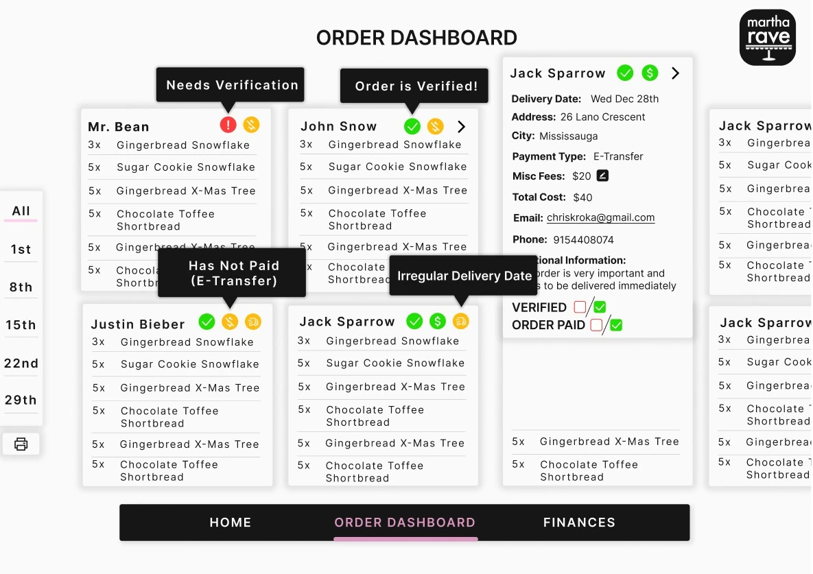
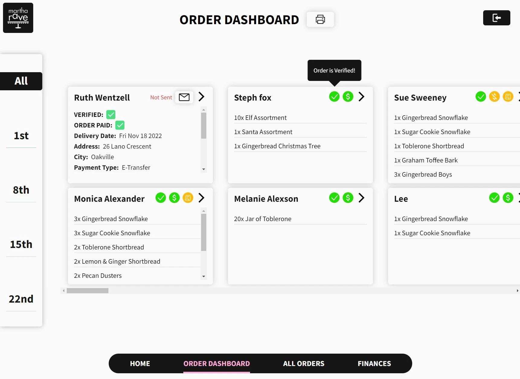
Here is the final design of the order dashboard. A
few notable changes were made between low-fidelity
and high-fidelity.

The first change I made is placing order status
information into icons with pop-ups. This reduces
the amount of page real estate that’s taken up with
text, and since they are icons the meaning behind
them can be intuited. Additionally, if my aunt ever
forgets what an icon means, she can hover over it to
to display a pop-up description.
Additionally, the cards expand when the top-right
arrow is clicked, displaying the rest of the order
details. That way my aunt still has access to all
the necessary information, but isn’t bombarded with
all of it at once when only half of it is required
at a time.
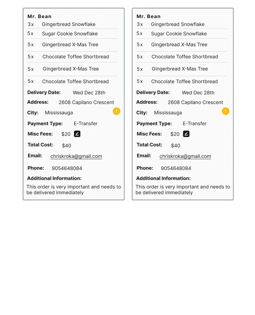
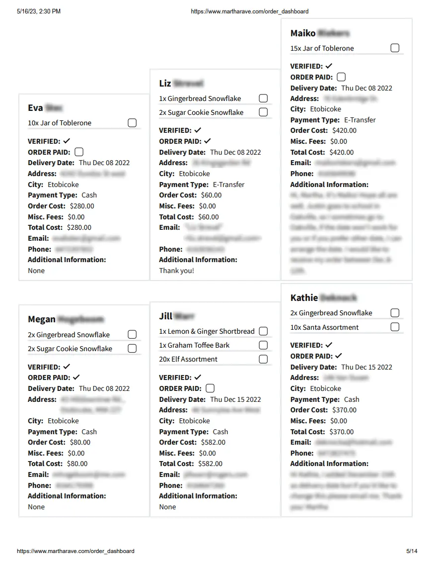
Finally, I added a more fleshed-out print layout,
which was tailored to my aunt’s exact needs. Since
she wanted to print off each order and attach it to
the physical order, she wanted all of the order
information to be displayed. I jumped immediately to
a medium-fidelity prototype due to time constraints,
and implemented the high-fidelity prototype directly
into the website after receiving feedback from my
aunt.

Final Design
After receiving more feedback on the high-fidelity
prototypes, I got to work implementing the website
in code.
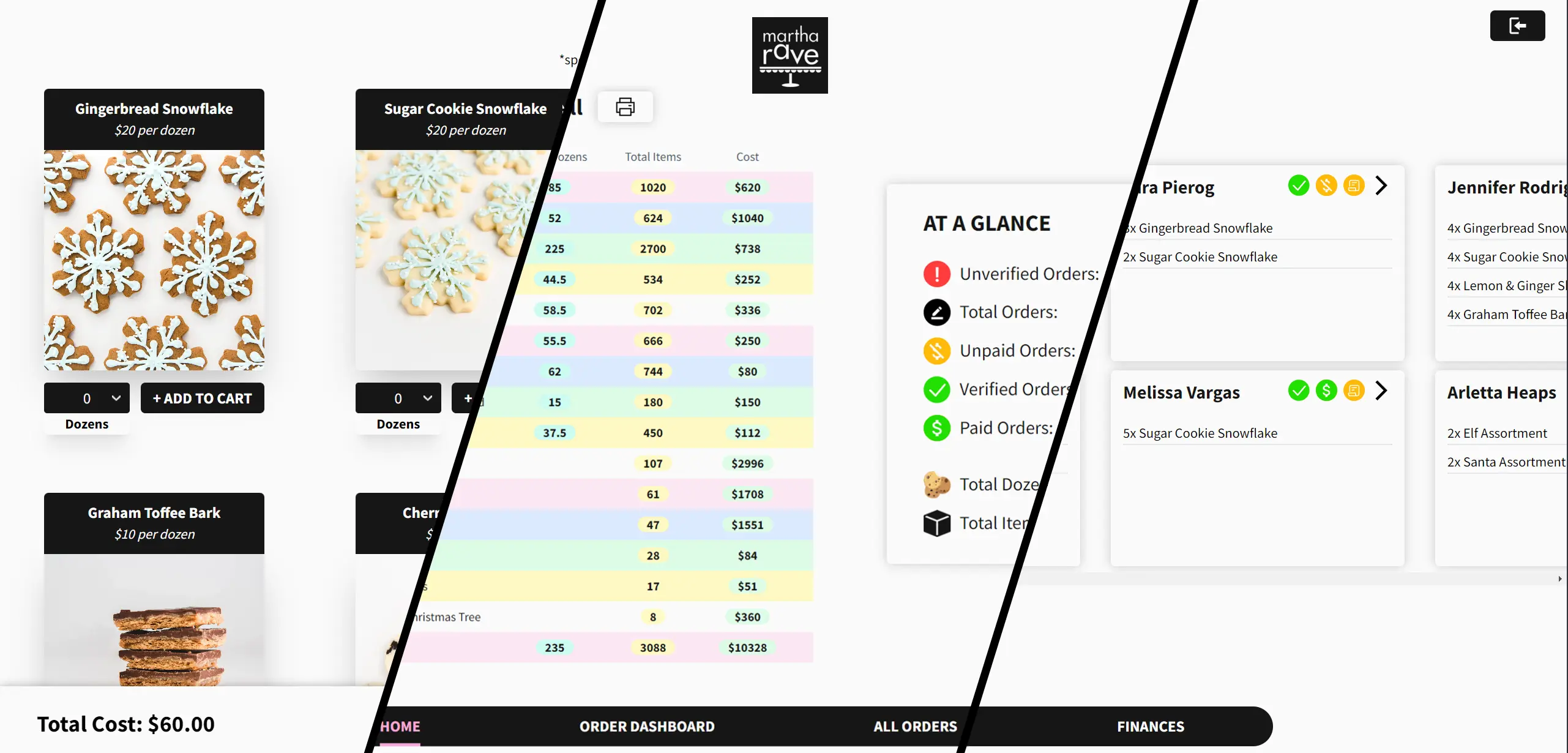
I used a Next.js and tailwindcss front-end (hosted
on Vercel) and a PostgreSQL back-end (hosted on
Supabase). For my data queries I used custom
PostgreSQL functions, to optimize query efficiency.

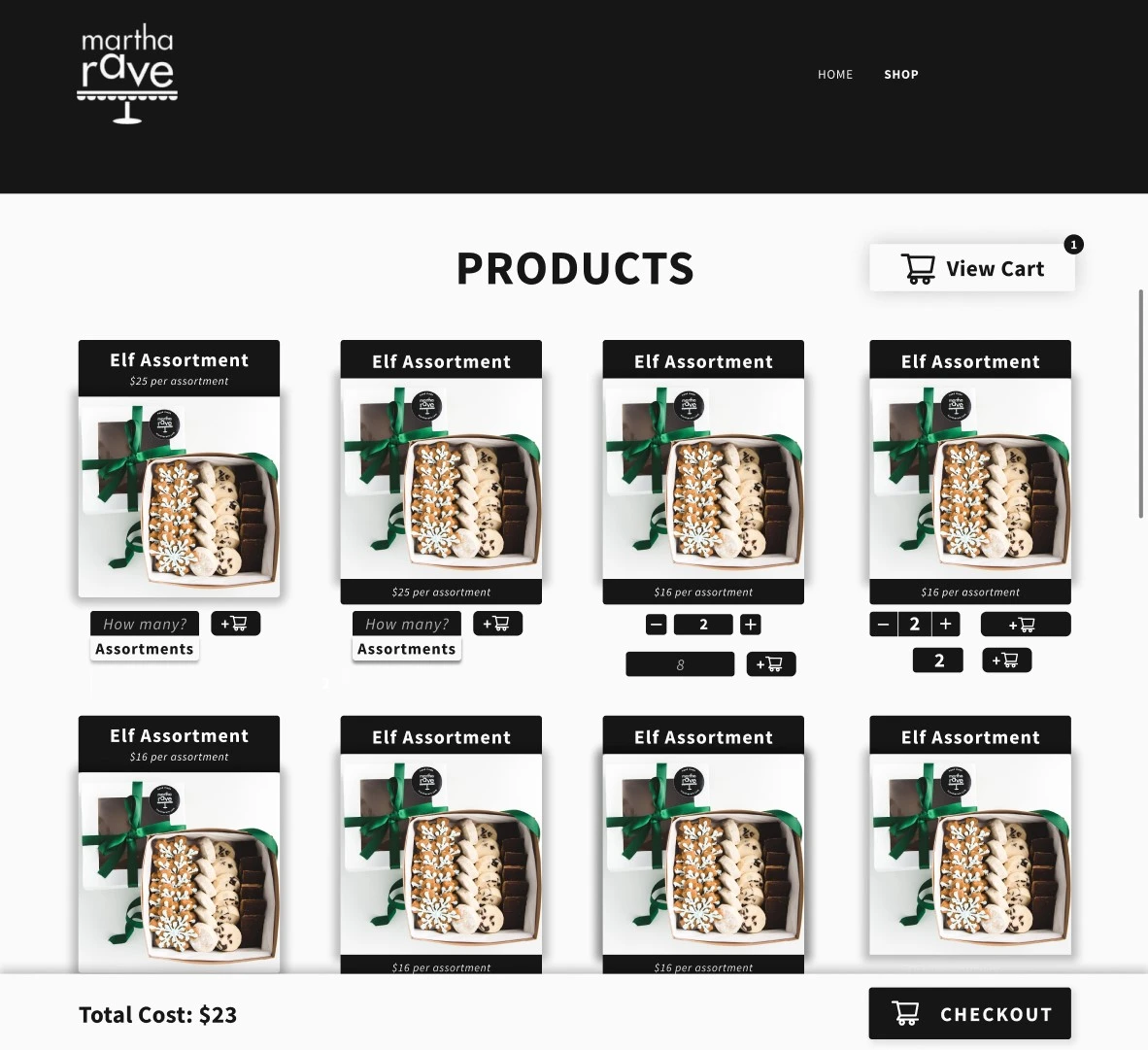
-
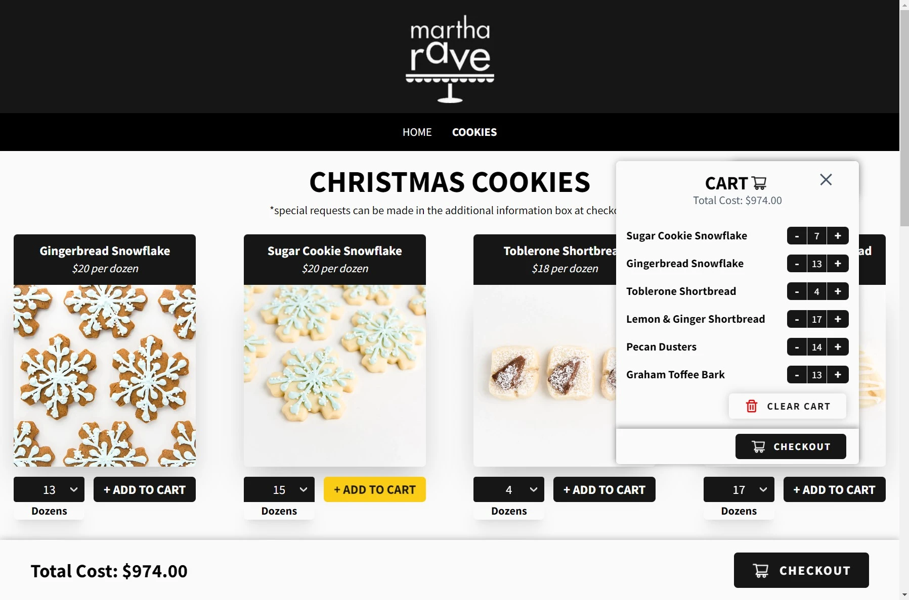
The total cost is calculated and displayed to
the customer
-
Product names and costs are visible, as well as
how each quantity is measured (per cookie,
donzens, etc.)
-
Quantities can be updated either directly on the
storefront or in the cart that can be toggled
open or closed
-
If it exists, the description of the item can be
viewed by clicking on the product card. It will
flip over to reveal more details

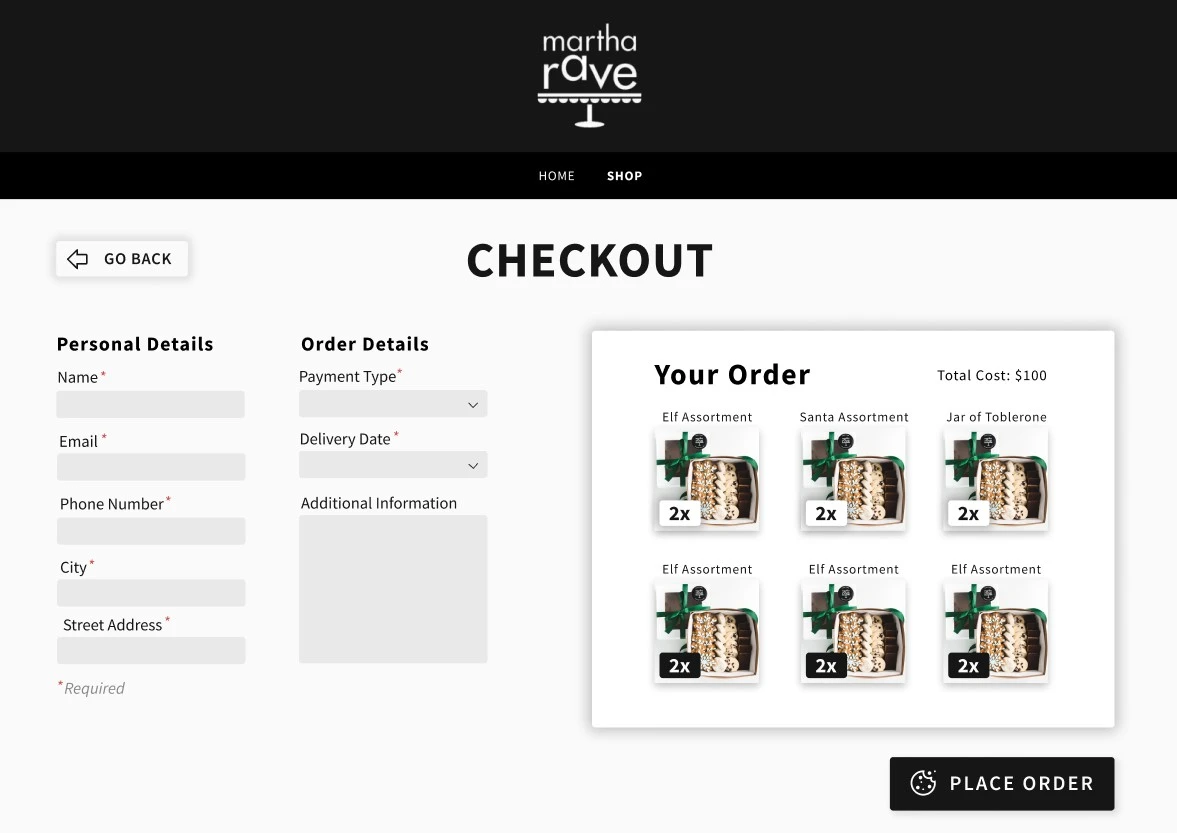
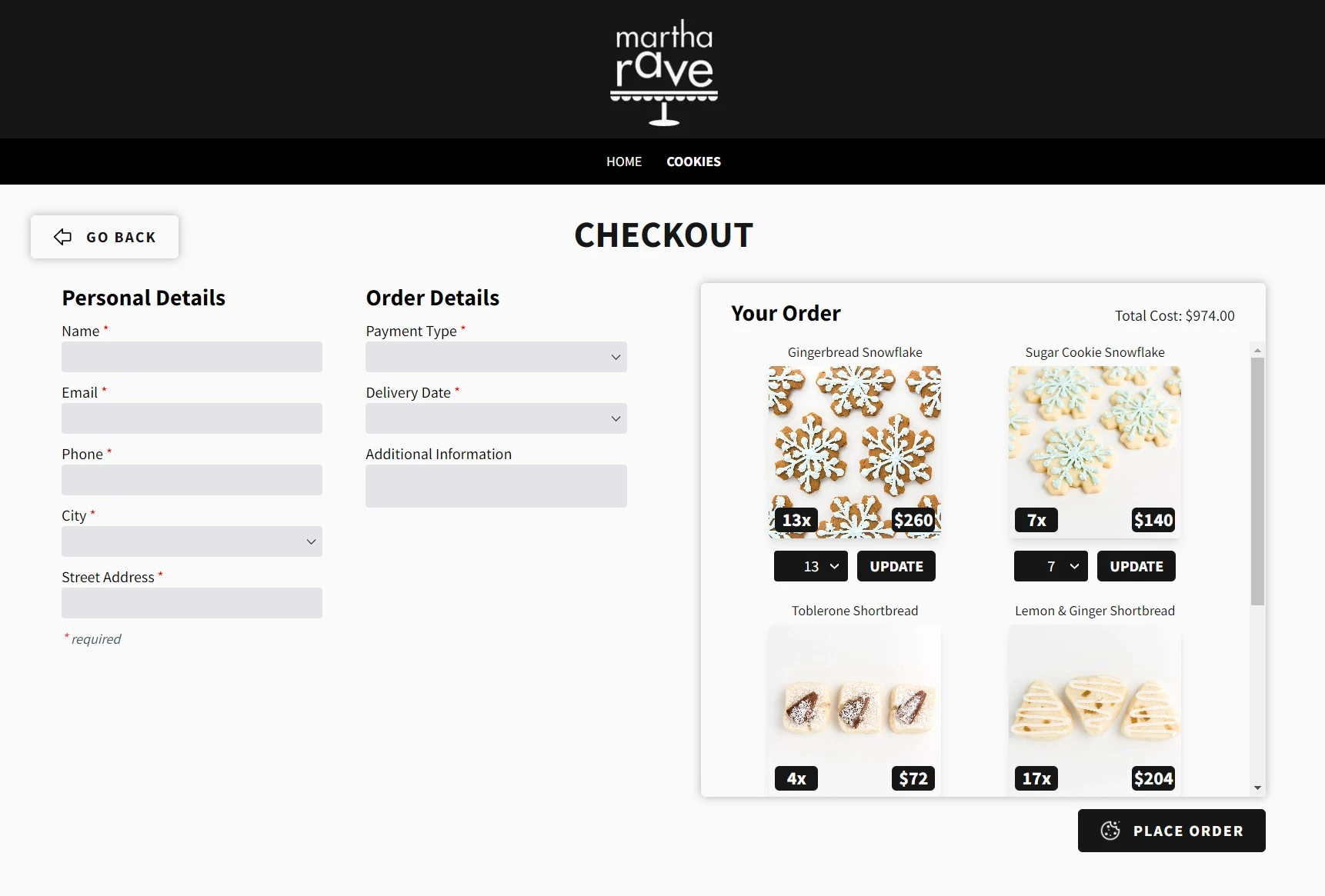
- Required fields are clearly denoted
-
Order quantities can be updated in the checkout
-
Back button in case customer wants to add
further items to their cart
-
Large “PLACE ORDER” button with secondary colour
to draw customer’s attention and minimize
confusion

-
Thank you page to inform the customer to check
their email
- Option to place another order

-
An email is sent to the customer with names,
pictures, quantities, and costs of each item to
avoid confusion
-
Order details are also contained in the email so
the customer can double-check they have the
right information

-
Table to display total dozens, individual items,
and item costs
-
Filter bar to show only items that need to be
delivered between pre-determined date ranges
-
“At a glance” box displaying aggregate order
information - useful for keeping track of
unverified orders

-
Print layout that displays the same information
contained in the homepage dashboard table
-
Bubbles next to each table item to allow
alterations of quantities after the page has
been printed. This removes the need to print
multiple of the same page

- Order table that displays one order per row
- Ability sort by date range
-
Edit feature to allow changing of order
information
-
Ability to delete entire order, along with
“confirm deletion” modal


-
Order cards that display order quantities on the
front of the card and further order details on
the back
-
Clicking the arrow on the top right of the card
flips the card over
-
Order status icons with detailed popups on hover
-
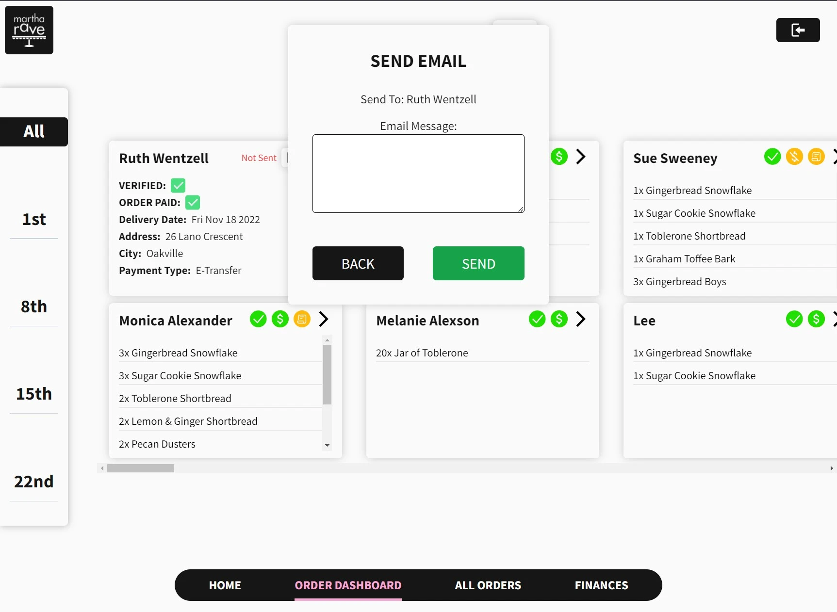
Ability to send emails to customers directly
from the UI

-
Order details printout, perfect for printing,
cutting out, and stapling to an order
-
Checkboxes next to each order item which can be
checked off as they’re packaged for delivery
-
Verification and payment status checkbox to
ensure the current order has been verified and
the customer has paid
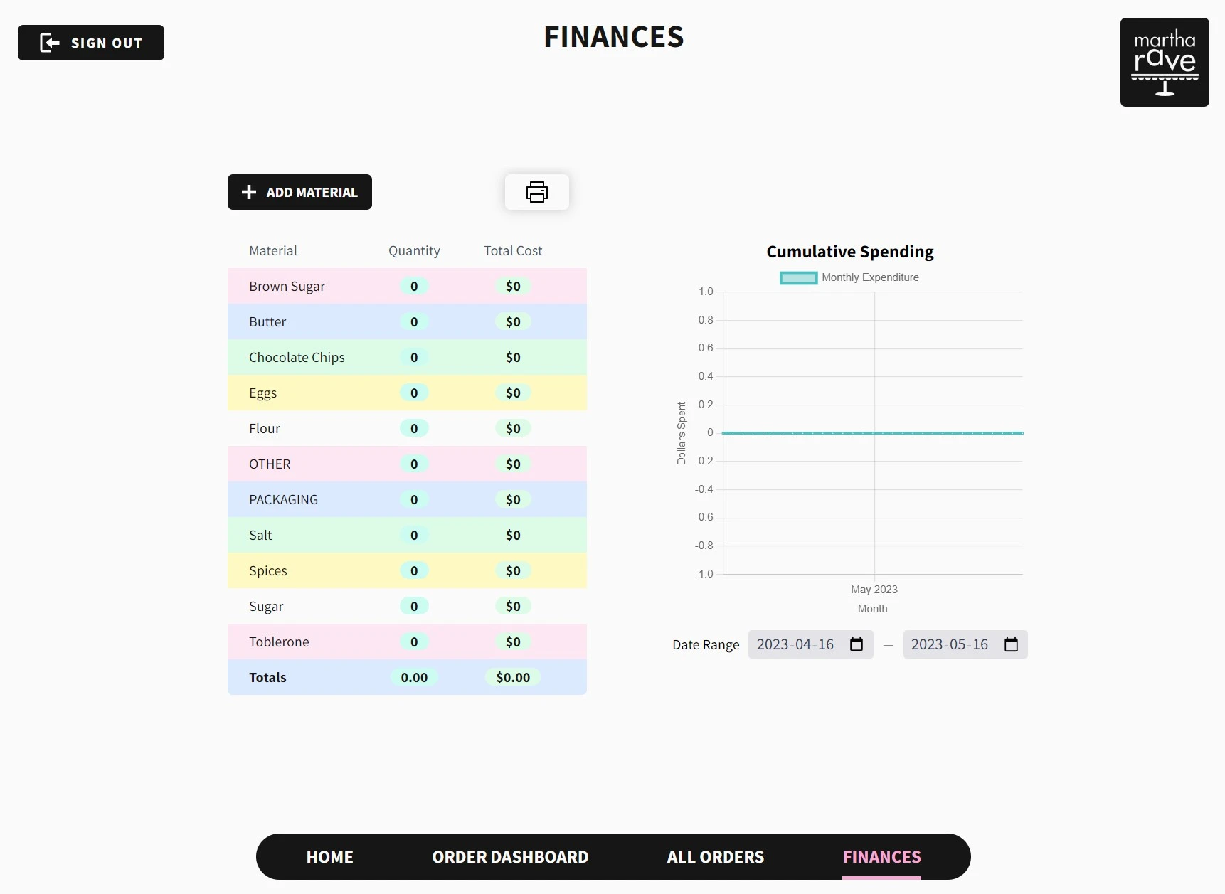
At the end of the project, my aunt requested I build
something to keep track of her ingredient purchases.
I obliged and quickly whipped up a finances page.
This page allows my aunt to input the quantities and
prices of ingredients she buys from the grocery
store, which will be plotted on a graph.
Before, the only data she had to keep track of her
expenses is her credit card statement. Now, she has
a detailed breakdown of how much she’s spending and
when.

Conclusion
After everything was implemented, all feedback was
received and incorporated, I handed the website off
to my aunt. She used it right away to process orders
for the Christmas season, and absolutely loved it.
She also told me multiple accounts from customers
that emailed her to let her know how much they liked
the storefront and checkout process. A success
across the board!
I was glad to hear all my hard work had paid off,
and I fully credit this towards the systematic
approach I took when addressing the pain points my
aunt was facing.
All in all, the key pain points were addressed and
solved in each step of the process, and although my
aunt had some minor critiques after using it, the
majority of the platform was an immediate success.
All told, this platform ended up cutting time spent
on operations by 15%, likely reduced customer time
expenditure as well, and most importantly -
decreased the amount of stress and multi-tasking in
my aunt’s workflow.
Also - fun fact: everything on this platform besides
paying for a domain name is completely free. And,
since I took her website off of GoDaddy and put it
on Vercel, she ended up paying LESS than before,
which resulted in a 75% reduction in website
expenses.
My biggest takeaways?
-
Don’t get too attached to your
designs. You’re designing for a client/customer
not for yourself
-
User feedback is CRITICAL
at every stage in the design process. The longer
you wait, the harder it is to change
implementations
-
How to design a website for older
adults
- the web isn’t as intuitive as I thought!
-
And of course,
how to build a website from scratch, with a functional back-end and front-end
 UserTesting
 Optimal Workshop
 Figma
Figma


